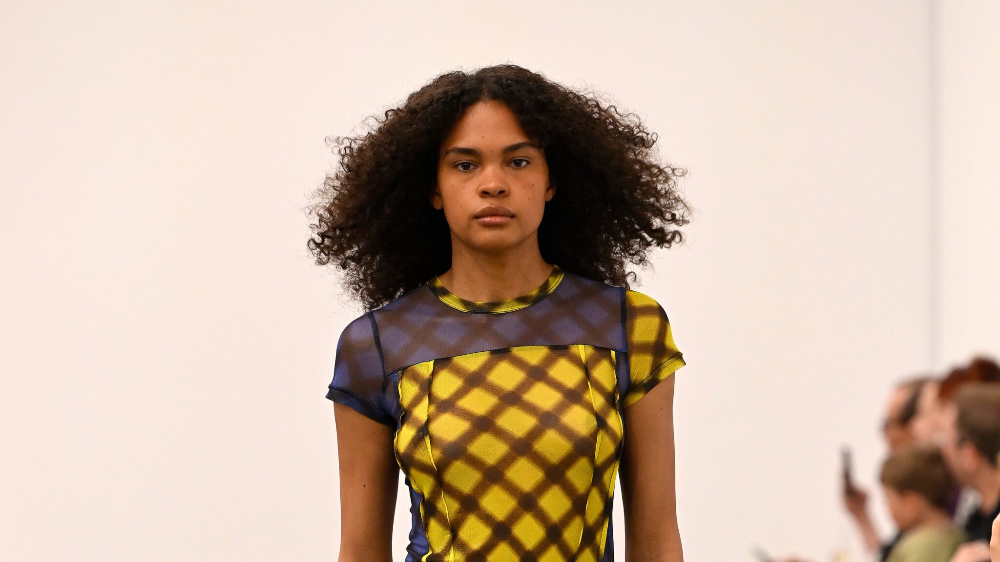
In the middle of Verner’s resort show, it struck me that the clothes were exactly what people think of when they think of Australian Fashion Week: a resort! beaches! surfers! – unless it is done to the umpteenth cool degree. It was by design. “Above all [resort] was about expanding on certain techniques, like tying and tying, and using Australia’s history with surfing as a kind of aesthetic framework,” designer Ingrid Verner said backstage after the show. “But my work has always been about elevating everyday pieces: the T-shirt, the board shorts, and this season I also wanted to combine this idea of 80s and 90s evening wear with more purposeful pieces.” This was beautifully executed in a lipstick red fitted jacket with slightly voluminous sleeves and a subtly nipped in waist paired with red and fuchsia wide board shorts – both in the nylon fabric typical of beachwear.
She managed to combine these two specific ideas with her half-t-shirt/half-nylon dresses; a black number with a dropped waist and an almost hidden sexy pleated cutout at the hip was a highlight. Elsewhere, her experiments with ropes and pleats on striped T-shirts provided a fresh new take on the classic marinière, including a punchy yellow and neon lime-striped, pieced dress that cut out the curves of the bust and hips, the bias cut panels of cotton that resemble those of a glamorous vintage slip dress. Her mesh pieces, whose print came from a vintage piece of seersucker that was digitally manipulated, actually stood out thanks to her pleating and layering techniques. A simple T-shirt with a contrasting square panel on the front and two seams on either side was paired with a draped skirt, pleated and layered with four different colors of the same fabric, and yet the look still retained a sense of ease and ease.
Other highlights included a hibiscus print twill jacket in mustard and caramel tones, paired with caramel track pants, and experiments with upcycled denim. “This is the beginning of my ideas in overprinting,” she explained. “I work with a leg of one pair of jeans and the top of another pair and stick them together like a puzzle and then press over them.” A cream-colored pair featured navy blue gradient stripes that went from thin to thick with an ’80s Miami graphic design, while a black pair with the same treatment in red was tailor-made for beach goths (they exist!).
“That line between the cherished and the discarded is very important to me,” Verner said. “Thinking about what is special and what I respond to emotionally when I go into a store, the things that randomly come to mind; it is that random combination of things that creates interest in my brand.” She is right.


