


What is the color wheel for nails?
Most people choose nail polish on instinct. Something stands out on the shelf, it feels right for the season, and that’s that. But there’s a whole science behind these instincts, and understanding the nail color wheel can really change the way you approach each set. Color theory isn’t just for artists and designers. It’s a framework based on how light, pigment and human perception work together, and it applies directly to your nails.
The color wheel is a circular arrangement of colors organized by their relationships. It starts with three primary colors: red, yellow and blue. Mix two primary colors and you get a secondary color. Orange, green and violet are in between. Mix a primary with a secondary and you get a tertiary, such as red-orange or blue-green. That’s twelve positions on a wheel, and every nail polish you’ve ever loved is on there somewhere.
Simple concept. Powerful results when you actually use it.
The science behind color in nail design
Here’s where things get really interesting. Color is not a property of an object. It’s a perception. When light hits a surface, some wavelengths are absorbed and others bounce back. Your eye has three types of cone cells, each sensitive to different parts of the light spectrum: roughly red, green and blue. Your brain then combines those signals and interprets them as a specific color.
So when you look at a coral nail polish, you don’t see coral in the product. You see the wavelengths that the pigment has not absorbed reflected back to your eye, interpreted by your brain. That’s why lighting changes everything. A color that looks warm and peachy under salon lighting can appear almost orange under cool daylight. The pigment has not changed. The light source has done that, and so the reflected wavelengths shift.
Your brain also automatically reads contrast and harmony. It compares colors with each other, not separately. Therefore, a color can look completely different depending on what is next to it.
Understanding color relationships on the wheel
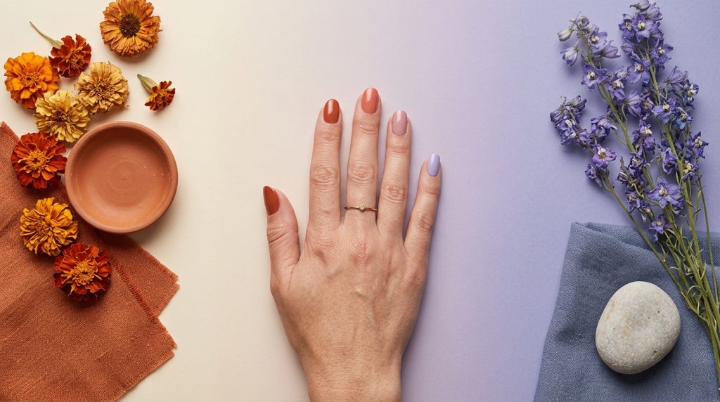
Once you understand the structure of the wheel, the relationships between colors start to make sense instead of feeling like guesswork.
Complementary colors sit directly opposite each other on the wheel. Blue and orange. Red and green. Purple and yellow. Because they reflect completely different wavelengths, placing them side by side provides maximum contrast. Your eye moves between them. Used properly this is striking and dynamic. Used carelessly, it is visually chaotic, especially on the small canvas of a nail.
Analogous colors sit next to each other on the wheel. Think of terracotta, burnt orange and warm yellow. Because they share similar wavelengths, they feel harmonious and cohesive. Analogous nail color combinations often feel effortless and sophisticated. They are also forgiving, as the notes naturally support each other rather than compete.
Triadic schemes use three colors evenly distributed around the wheel. Red, yellow and blue. Or orange, green and violet. These create a balanced contrast without the visual tension of complementary combinations.
Triadic nail art designs often feel playful and daring, while still feeling considered.
Warm vs cool colors in nail design
The warm and cool divide is one of the most practical tools in nail color theory. Warm colors are in the red, orange and yellow half of the wheel. Cool colors live in the blue, green and purple half. But here’s the detail most people miss: each color has a warm or cool version within its own family.
A red color can be warm (think tomato, brick) or cool (think raspberry, cherry). A nude can read warm (peach, caramel) or cool (taupe, mauve). When you unintentionally mix a warm-leaning color with a cool-leaning color, the result can look muddy or simply “off” for no apparent reason.
The interaction with skin color makes this even more important specifically for nails. Warm skin tones often harmonize with warm nail colors. Cool skin tones often suit cool tones. But contrast also works: a deep, cool burgundy red on warm skin creates a striking effect precisely because of that tension.
Knowing the difference can help you make that choice consciously, instead of running into it.
How pigments behave in nail products
This is where nail color theory separates from standard art theory, and where the science becomes specific to your nails.
Not all colors behave the same way in gel or acrylic. Coverage varies greatly between pigments. Some colors, especially yellow, orange and certain shades of red, naturally have lower opacity. They may need several coats to reflect the color of the bottle. Others, like deep black and bright white, are very opaque and can overpower a blend if you’re not careful.
Transparency also affects how colors interact when layered. A sheer warm pink on a cool base can change the overall tone in ways that only become apparent once the product sets. Undertones are more important than surface color in these situations. Two nudes that look similar in the bottle can behave very differently on the nail if one has a pink undertone and the other looks yellow.
Some pigments also neutralize each other. Mixing complementary pigments in the same formula does not create vibrant contrast. Instead, it creates a dull, gray tone because the opposing wavelengths cancel each other out. That’s why a custom color mix produces a muddy finish instead of the expected clear mix.
How to choose better nail color combinations
Start with the wheel. Determine where your chosen color is and decide which relationship you want to use. Complementary to drama. Analog for harmony. Triadic for balance.
Then check the undertones. Unless you are deliberately using contrast as a design feature, make sure the colors you combine have a warm or cool tone. A set built on warm terracotta, warm gold and warm nude will always feel cohesive. All three speak the same tonal language.
Also consider the nail as a small surface. What reads as balanced contrast on a large canvas can feel overwhelming on nail scale. Simpler combinations often land better. A two-tone complementary combination with a bright accent nail is usually more effective than five competing colors on ten nails.
When in doubt, go simpler. You can always add complexity once the foundation is solid.
Common mistakes when using the color wheel
The most common problem is not choosing the wrong colors. It ignores undertones and focuses only on the surface color. Two colors may look like they match in the bottle, but visually clash on the nail because one looks warm and the other cool.
Too many competing colors is another common problem. Triadic schemes work because the three colors come together with intention and balance. Randomly adding a fourth or fifth color for no structural reason breaks that balance and creates visual noise.
Lack of contrast is the quieter fault. Analogous combinations are nice, but if the values (light and dark levels) for all colors are too similar, the design loses its definition. A small value shift, a slightly deeper or lighter shade within the analog group, adds dimension without disrupting the harmony.
Finally, think about scale. A color that looks rich and complex in swatch form can disappear or overwhelm by nail size. So always think about what a color looks like on a small scale, not just what it looks like in the bottle.
The most important takeaway
The color theory for nails is not abstract. It is based on the way your eye perceives light, how pigments interact with each other and how the brain perceives harmony and contrast. In every confident, well-put-together nail look you’ve admired, these principles work whether the person who created the nail consciously knew it or not.
If you understand the science, you can make those choices consciously. That’s the difference between a set that looks good by luck and a set that looks good by design.
Knowing the theory is one layer. To apply it through a real product, where real gel or acrylic actually behaves, requires a technique built on that foundation. The science of color in the applied arts consistently shows that practitioners who understand the underlying principles make faster and more confident decisions at every stage of their work.
Understanding color theory is really exciting, but translating that knowledge into beautiful results on real nails takes guided practice. Knowing why colors work is the basis. Knowing how to apply that in products is the next step.
If you want to take your color knowledge further, MyNailEra brings together tutorials from 12 award-winning nail artists who work with these principles every day. Era, your personal nail coach, can also give you feedback on your own color choices, so you can see exactly how your combinations are performing and where you can refine them. Explore MyNailEra to see how it works.