
Why the same paint looks different every time
Have you ever painted your nails in bright neon just to look completely different on your friend’s hand? Or have you noticed that a color you liked fell flat in the bottle as soon as it was on it? That’s nail color contrast at work, and it’s one of the most fascinating ideas in nail art. Nail color contrast changes how colors appear depending on what is next to them, under them and even around them. It’s not so much about the paint itself. It’s about the relationships between colors and how your brain interprets them.
This is the kind of knowledge that quietly transforms every nail design decision you make. Once you understand it, you will never look at a color combination the same way again.
The science behind nail color contrast
Your eyes do not process colors in isolation. They compare them. The moment two colors are next to each other, your brain adjusts how it reads each color. Scientists call this simultaneous contrast and it explains why neon pink looks electric next to black, but almost faded next to white.
It sounds counterintuitive. A bright color is just… bright, right? But clarity is relative, not absolute. Your eye measures what it sees and what surrounds it, continuously and immediately. The deep navy blue makes a pale lavender look almost white. A warm coral reads very differently on a nude base than on a terracotta base. The same polish. A completely different visual result.
This is also why nail art color contrast is such a powerful tool. You don’t just choose a color.
You choose a relationship between colors.
Value: the real driving force behind visual impact

In color theory, “value” refers to how light or dark a color is. And value contrast is perhaps the biggest factor in whether a nail design will stand out or disappear.
High-contrast combinations, such as black and white or deep plum and pale gold, create a strong visual impact. The eye is immediately drawn in. Low-contrast combinations, such as dusty rose on blush or sage on mint, create a softer, more blended look. Neither is better. They just do different things.
If you’ve ever wondered why some nail designs look striking in photos while others look muddy, value is usually the answer. The colors can both be beautiful individually. But if their values are too similar, the design loses its definition. You lose the details. You lose the drama.
This ties directly into the basics of how color relationships work on the wheel, where understanding light, dark, and saturation helps you build combinations with intention rather than guesswork.
Optical illusions and color perception in nails
This is where color perception in nails becomes truly mind-boggling.
Take the same medium-toned red. Paint it over a black base and it looks rich, deep, almost jewel-like. On a white base, the same shade appears brighter and much more intense. Place it next to orange and it suddenly looks cooler, while combining it with purple can make it look warmer. The color has not changed at all. Your perception of it is.
Professional nail artists think carefully about the background before planning the design on it. The background is not neutral. It actively determines how each color above it reads. When a design seems to ‘pop’, the artist understood this relationship and used it consciously.
It’s also why some color combinations that look wrong in theory work brilliantly in practice. A high contrast between unexpected colors provides that electric, striking quality that makes a set stand out. The visual tension is similar in spirit to what makes the light physics in cat eye nails so visually appealing. Contrast and light perception always work together.
How to use nail color contrast in nail designs
So how does the color contrast of nail art actually manifest itself in real design choices? A few areas where it matters most:
Accent nails. An accent nail works because it creates contrast with the rest of the set. The greater the difference in value between your accent and your base color, the more dramatic the effect. A matte black accent on shiny nudes provides high contrast. A shimmering pink on soft pink has low contrast. Both are valid, but they create very different moods.
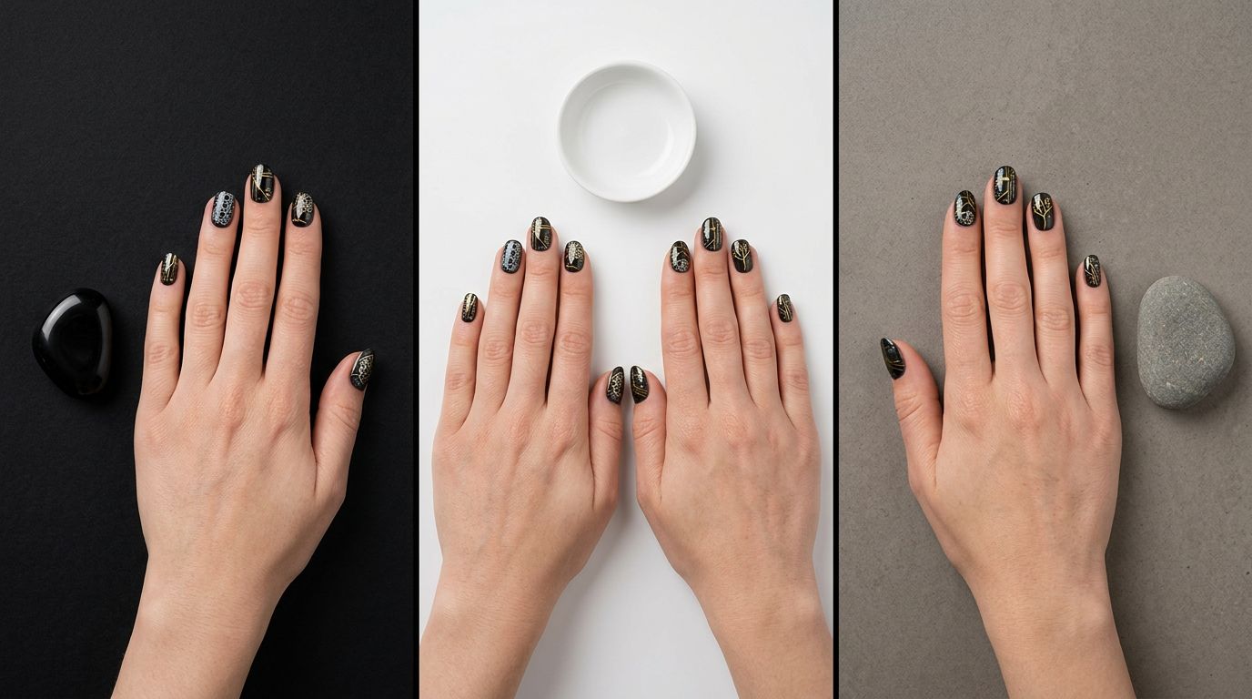
Outlines and negative space. Thin contours in a contrasting color ensure that shapes are clearly legible. Dark outlines on light designs neatly define the edges. Light outlines on dark designs do the same in reverse. Both use value contrast to keep the art from fading. This is why minimalist nail color contrast designs look so clean and modern. You sketch shapes in one contrasting shade, and even without complex technique, the result feels sharp and deliberate.
French tips and reverse French. The classic French tip works because of the contrast between the natural nail and the white tip. Reverse French reverses that contrast and creates a completely different visual weight. Modern nail polish trends go one step further, using deep colors on the tip against a pale base, or even coloring the nail in different zones.
Background choices in nail art. Easy contrast designs for nail art often start with a strong background decision. A dark background makes light colors shine. A light background makes dark colors feel graphic and powerful. Before you plan the art, decide what you want the background to do for your colors.
Why this is more important than ever in 2026

Nail trends for spring 2026 lean into an unexpected contrast. Deep, saturated bases combine with soft, chalky art. Micro-geometric designs in sleek black sit on creamy white tones. Bold, single-colored nails match a complementary shade on the accent finger.
The mood moves away from matching and towards intentional tension between colors.
Nail color contrast for beginners does not mean that you have to remember any rules. It means training your eyes to ask one question before choosing a color: What does this look like next to it? Ask it often enough and it becomes instinctive. Your design choices become sharper every time.
Color perception in nails is one of those things that seems technical until you see it in action. Then you can no longer see it.
Good nail color contrast requires more than just knowing the theory. Translating it into a real design requires control, confidence and solid engineering.
If you want to go deeper, MyNailEra offers tutorials from 12 award-winning nail artists who use color contrast as their main design tool. Era, your personal nail coach, can view photos of your nails and give you specific feedback on what’s working. Discover the technique well in the MyNailEra app.